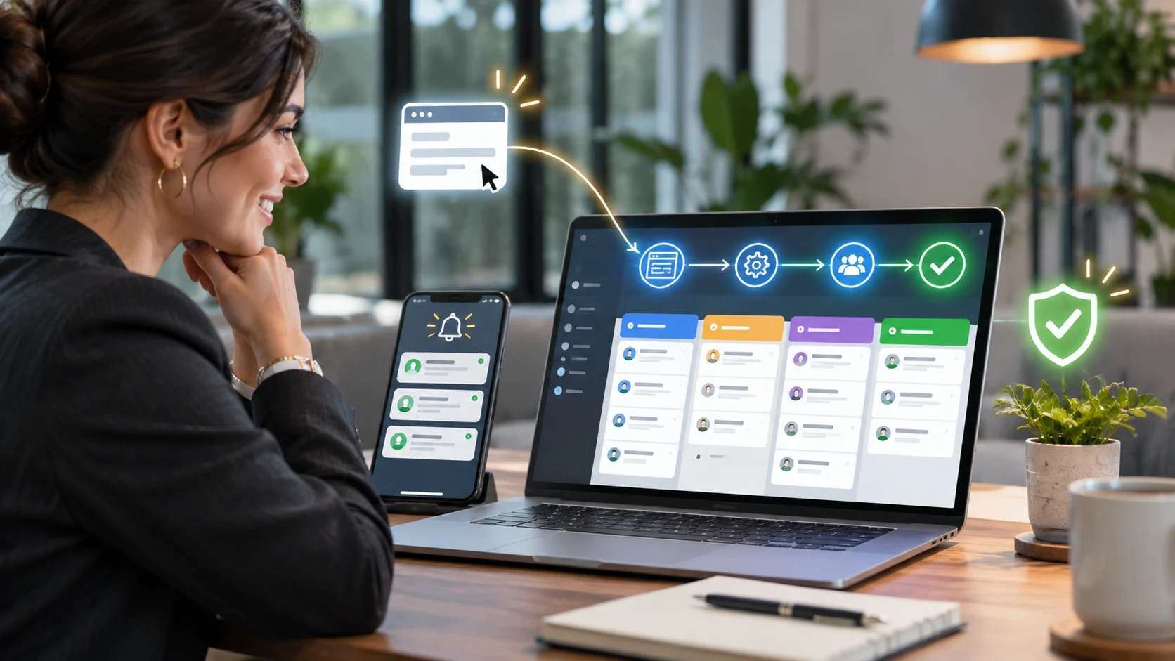
Your website is getting visitors. Google Search Console shows impressions. Google Analytics shows sessions. Maybe you are paying for ads as well. Yet your inbox is quiet, your sales team has few qualified enquiries, and your website is not doing the job you built it to do.
That does not automatically mean you need a new logo, more animations, or a complete rebuild. Often, the real problem is the journey between arriving on a page and deciding to contact your business. An unclear offer, weak trust signals, confusing navigation, a broken mobile form or slow lead response can waste otherwise valuable traffic.
The solution is conversion-focused web design: designing and engineering pages around the questions buyers need answered and the actions they are ready to take. Here are 12 practical fixes for 2026, plus a way to determine whether you need small changes, a landing-page rebuild, or a complete website redevelopment.
Quick answer: Why does a website get traffic but no leads?
The most common explanations are a mismatch between visitor intent and the offer, an unclear value proposition, poor landing-page experience, weak credibility, an inconvenient contact path, technical defects, or leads that are not being recorded or followed up. Start by validating your tracking and testing a real enquiry end to end. Only then decide what to redesign.
| What you see | What to investigate first |
|---|---|
| Traffic is rising but enquiries are flat | Traffic quality, page intent, call to action and lead attribution |
| Visitors view service pages but leave | Offer clarity, proof, pricing expectations and next step |
| People click Contact but rarely submit | Form validation, mobile layout, errors, required fields |
| Form submissions occur but sales never receives them | Email deliverability, CRM integration, spam filtering and assignment |
| Mobile traffic dominates but leads are desktop-heavy | Mobile interaction, overlays, button reachability and page speed |
1. Measure real leads before changing the design
Start with the commercial action that matters: a legitimate consultation request, quote enquiry, booked meeting, or qualified phone call. A button click is not the same as a lead. Neither is a visit to the contact page.
Submit your contact form from a phone and desktop with test details. Check whether the website displays success, whether the message reaches the correct inbox or CRM, and whether analytics records exactly one successful event. Repeat using a privacy-compliant test workflow, and confirm error messages appear for invalid entries.
Then review landing page, device, traffic source and conversion results together. A rising traffic graph can hide a falling rate of qualified enquiries.
2. Match each landing page to the visitor’s actual intent
Someone searching “custom WordPress development agency” is evaluating technical competence. Someone searching “what is WordPress” may only want education. A single generic homepage cannot meet both expectations equally well.
Review the queries and campaigns bringing visitors to each important page. For commercial queries, show the relevant service, typical scope, process, evidence and a clear consultation path. For educational traffic, offer an appropriate next step without pretending every visitor is ready to buy.
Create or refine dedicated pages for materially different services rather than pushing every search query to one vague services page. This improves clarity for visitors and makes internal linking more meaningful.
3. Make the first screen explain what you do, for whom and why it matters
A visitor should not need to decode a slogan such as “We transform digital possibilities.” Replace abstract copy with a direct statement describing your service, ideal customer and business outcome.
For a B2B software agency, “Custom web platforms and integrations for growing service businesses” is clearer than “Digital excellence reimagined.” Place a useful subheading immediately below it, and show one primary next step.
Ask five people unfamiliar with the business to look at the opening screen for a few seconds and explain what the company does. If their answers differ wildly, the message needs work.
4. Make the main call to action unmissable and relevant
“Learn More” may be acceptable for low-intent browsing, but a buyer considering an agency needs to understand what happens after clicking. Try a concrete action such as “Discuss My Website Project” or “Request a Website Growth Consultation.”
Use a primary CTA in the opening section, a contextual CTA after addressing a meaningful objection and a closing CTA when the buyer has enough information. Avoid stacking four competing buttons of equal prominence.
The button should lead to a relevant form or booking flow, not an unrelated generic page. Test that the path works from an actual mobile device.
Planning a redesign but unsure what is preventing enquiries? Request a Website Growth Consultation to discuss the commercial and technical bottlenecks.
5. Replace attractive-but-generic sections with decision-making information
An impressive-looking page can fail if it never answers the questions buyers have before making contact. Service buyers want to know whether you understand their problem, what you will deliver, how the work is managed, and what makes the engagement credible.
A strong service page should explain: the specific problems you solve; the deliverables or scope; who the solution is suitable for; your process; relevant proof; realistic next steps; and how to enquire. Add timelines or budgets only where you can explain the assumptions. Avoid vague guarantees.
Businesses with custom requirements often benefit from custom web development services that connect user experience with maintainable functionality and reliable integrations.
6. Put credible proof near the decision point
Trust is earned through specific, verifiable evidence. Display genuine client reviews, project summaries, relevant industries, technologies, certifications or demonstrable outcomes where you have permission to use them.
Do not add fabricated logos, anonymous five-star testimonials or invented percentages. If you cannot publish detailed revenue results for a client, you can still explain the before-and-after problem, the delivered architecture and what was tested or improved without inventing metrics.
Place proof next to key offers and consultation actions rather than burying every testimonial on one separate page. Buyers should see evidence at the moment they are deciding whether to proceed.
7. Design mobile contact journeys for thumbs, not desktop screenshots
Many websites look polished at 1440 pixels but become difficult to use on smaller screens. Sticky headers can obscure content; pop-ups cover fields; two-column forms become cramped; and the main CTA disappears below decorative images.
Test real tasks at narrow widths: open the page, identify the service, find proof, tap the CTA, complete the form, and return to the page. Use visible labels, readable type, adequate tap targets and a straightforward form layout. Do not rely on a screenshot alone to declare the mobile version complete.
Accessibility is part of usable design. Labels, clear error messages and programmatically identifiable common input purposes make forms easier to complete for more people. See the W3C’s WCAG 2.2 guidance.
8. Remove unnecessary friction from enquiry forms
A first-contact form generally needs enough information to understand the project and reply, not a complete procurement questionnaire. Use only the fields needed at this stage, make required fields explicit and preserve entries when a validation error occurs.
For example, a project enquiry may begin with name, business email, service interest and a brief message. Budget or timeline questions can be optional or presented when qualification truly requires them. The correct field count depends on the buying process; test rather than copy a universal number.
Provide an accessible confirmation message and ensure the submitted enquiry actually enters the sales workflow. A beautiful form that silently fails is more damaging than an ordinary form that works every time.
9. Improve speed without treating the PageSpeed score as the product
Large hero videos, unnecessary animation libraries, multiple font families, heavy page-builder output and third-party widgets can delay useful content and frustrate interactions. Reduce these costs by diagnosing the actual page rather than installing another optimization plugin by default.
Google’s recommended “good” Core Web Vitals thresholds are LCP within 2.5 seconds, INP at or below 200 milliseconds and CLS at or below 0.1, assessed from real user experience where data is available. These are useful quality targets, not a promise of higher rankings or more leads.
When a page is slow or unstable, consider a targeted website performance optimization assessment alongside the design work.
10. Make the navigation reflect how buyers choose services
Avoid menus made only from internal company language. Buyers understand “Ecommerce Development,” “Website Redesign,” “Business Automation” and “Contact” more easily than clever names that require interpretation.
Group related services clearly and provide a route from educational content to a relevant service page. Use descriptive internal links within the article body rather than linking every keyword or forcing a user to search the menu again.
When organic visibility is part of the plan, technical SEO services can help align page architecture, canonical URLs, crawlability and internal links with that user journey.
11. Connect the website with follow-up systems
Not every missed lead is a design failure. Some enquiries are lost after someone presses Submit: a notification goes to the wrong mailbox, an email is filtered, the CRM record is incomplete, or no one is assigned to follow up.
Map the journey from successful submission to acknowledgement, sales assignment and response. Build reliable CRM routing, alerts, error handling and duplicate protection. Then test failure conditions as well as happy paths.
For businesses handling multiple forms, teams or lead sources, business automation solutions can connect lead capture to dependable operational workflows.
12. Test improvements in priority order instead of redesigning blindly
Before commissioning a full redesign, build a short list of hypotheses. For example: “The service landing page does not explain deliverables,” “The form is hard to use on mobile,” or “Qualified leads are not recorded correctly.” For each hypothesis, define what evidence would support it and what change you will test.
A sensible priority is: repair broken forms and tracking; fix severe mobile and speed problems; clarify the offer and CTA; add proof; then consider broader information-architecture and visual changes. This sequence helps you avoid spending on aesthetics before the commercial basics work.
Where traffic volume is sufficient, test one meaningful change against a baseline. On lower-traffic pages, combine task-based usability testing, session analysis where privacy permits and a longer observation period. Avoid treating small fluctuations as proof of success.
How to know if you need fixes, a landing-page redesign or a full rebuild
| Situation | Most likely next step |
|---|---|
| Tracking or contact form is broken | Repair the technical fault and measure again |
| One campaign page has high-intent traffic but low enquiries | Revise that page’s offer, design, proof and form |
| Service pages are confusing across the website | Improve information architecture and shared templates |
| Themes/plugins prevent reliable changes or integrations | Plan a technical redesign or custom rebuild |
| Leads arrive but go unassigned or unanswered | Repair CRM and automation workflow |
The right investment depends on the cause. A complete rebuild is justified when site architecture blocks necessary changes; it is not the automatic answer to every conversion problem.
What a conversion-focused web design agency should deliver
When assessing a partner, ask for an audit of key visitor journeys, clear conversion goals, responsive page designs, accessible forms, implementation quality, technical SEO preservation, analytics validation and post-launch review. Ask what decisions are based on evidence and how the team will know whether the project improved business outcomes.
Auto Computation combines responsive frontend development, custom website architecture, performance work, technical SEO and workflow integrations. That makes it suitable for businesses that want more than a visual refresh: they need a website that supports actual enquiries and future growth.
Frequently asked questions
Why is my website getting visitors but no enquiries?
It may be attracting low-intent traffic, presenting an unclear offer, lacking trust, creating friction in the contact journey, or failing to record or route enquiries. Diagnose the specific path before investing in a redesign.
Will a new website design automatically increase leads?
No. Better visual design can help clarity and trust, but lead outcomes also depend on audience intent, offer quality, usability, functional forms, follow-up and measurement. Require a baseline and a test plan.
What should I fix first on a low-converting website?
Confirm analytics and lead delivery first. Next check mobile usability and page-to-offer alignment, then improve the CTA and trust information. These checks help prioritize affordable fixes before major rebuilds.
How many fields should my enquiry form have?
Use only the information required to start a useful conversation and deliver a response. The appropriate number depends on the service and sales process; extra fields should earn their place through testing.
Does website speed affect conversions and SEO?
Slow and unstable pages can create friction and reduce user satisfaction. Core Web Vitals are one part of Google’s page experience considerations, but speed alone does not guarantee leads or rankings.
Should I use WordPress or a custom-built website?
Use the platform that supports content management, required integrations, security, performance and future changes without unnecessary complexity. A well-engineered WordPress site may be ideal for many service businesses; highly custom workflows may justify custom web development.
How long does website conversion optimization take?
Simple technical defects can be corrected quickly, while meaningful conclusions about lead improvement require a realistic baseline and adequate traffic. A broader redesign requires discovery, build, testing and measurement; exact timing depends on scope.
Turn your existing traffic into better business opportunities
More visitors are useful only if your website helps the right people understand your offer, trust your business and take the next step. The strongest improvements usually come from joining together copy, UX, page performance, development, lead capture and follow-up rather than treating them as separate projects.
If your website receives traffic but is not generating enough qualified enquiries, Auto Computation can help identify where the journey is breaking and whether a focused fix or a larger rebuild is appropriate.
Request a Website Growth Consultation — share the URL, your target audience and the enquiry problem you want solved.